I’m often asked what definition of usability we use at GDS.
My short answer is that a government service is usable if the people who need it can use it to get the right outcome for them.
It’s point 12 in the Digital Service Standard - make sure users succeed first time.
And it’s one of the 3 primary measures of a service we’re using for the Cross-Government Service Data alpha - the number of transactions ending with the user’s intended outcome.
But some of the people who ask this question are really asking whether we use the definition of usability given in international standard ISO 9241:
The extent to which a system, product or service can be used by specified users to achieve specified goals with effectiveness, efficiency and satisfaction in a specified context of use.
My answer for them is a bit longer.
Effectiveness takes priority
In ISO 9241 terms, we care most about effectiveness - can people use the service to get the right outcome for them?
People come to government to do important things. If they can’t get them done, it can cause significant problems in some aspect of their life or work.
And those problems drive up government costs and stop policies achieving their intent.
We do care about efficiency. If part of a service is used by businesses or public servants several times a day, then designing for efficiency is very important. But in most cases we will sacrifice some efficiency to make a service more effective for more people.
And we do care about satisfaction. But we know that for most government services, how users’ feel about a service is very closely tied to whether they can use it effectively to get the right outcome for them.
To auto-tab, or not to auto-tab
An example of this is ‘auto-tabbing’. You’ll see this when you enter a value like a date, a bank sort code, or a license number, and the system moves automatically from one box to the next.
Forms on GOV.UK don’t auto-tab.
In usability testing, some participants notice this. And they grumble about it. But they quickly enter the information they need to, and move on.
At the moment, we don’t know a way to implement auto-tabbing that works for all our users.
And if auto-tabbing stops just a few people from using a service successfully, their needs take priority over the many people who might prefer but don’t need the feature.
Effectiveness for all users takes priority over efficiency or satisfaction for some users.
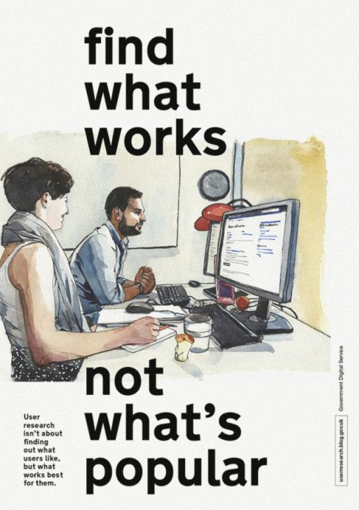
Find what works, not what’s popular
We’ve updated the guides to user research and user needs in the Service Manual to make this clearer.
And you can get a printable version of the Find What Works, Not What’s Popular poster.
We’d love to hear your thoughts, either in the comments here, or through the feedback links on the guides.
Follow John on Twitter and don't forget to sign up for email alerts.
7 comments
Comment by Pedro posted on
Interesting. But can you share what type of user get's 'stopped' by auto-tabbing?
Comment by John Waterworth posted on
If a user doesn't type so accurately and has difficulty positioning the cursor, auto-tabbing can make it hard for them to correct their typos. The page jumps them to the next input box while they're trying correct the contents of the previous input box. And because they're often looking at their fingers while they type, they end up typing into the wrong input box, which only compounds the problem.
Comment by Yuri posted on
Do you consider percentage of people that have a difficulty with auto tabbing (or any other UX feature)? Is there a tippping point when you will say - the benefits for majority outweigh the implications for the few and if so what is it roughly in percentage?
Comment by John Waterworth posted on
If the presence of a feature caused a significant problem for one group. And the lack of it caused a significant problem for another group. Then we would need to make some kind of calculation.
But the point is that, for us, a problem that prevents a small group of users getting something done, is a greater consideration than something a larger group would prefer but doesn't cause them a significant problem.
Comment by Angie Johnson posted on
Auto-tab is a great example!
An alternative solution could be A/B testing
e.g. no auto-tab vs. drawing the users attention to it - such as colour change of cursor or the text box whilst typing - drawing attention to a feature can facilitate use too
Sometimes, it may not be an 'either vs or'
Comment by Carol Butterfield posted on
Thanks John. Love this bit in particular: "Effectiveness for all users takes priority over efficiency or satisfaction for some users."
Comment by Ange posted on
Great post that really makes its point well. If something isn't effective then, by definition, it can never be efficient as it is simply "doing the wrong thing well" - something that many people just don't get!
I love the auto-tab example - the 'techie' default position is typically to use this sort of functionality as it makes forms easier to complete, but that's not always true.
Thank you!