We've been working to make it easier for GOV.UK users to find the content they need on the site.
As part of this work we've designed a new navigation for GOV.UK. This is now in beta on the new ‘education’ topic.
We’ve introduced a number of new design elements. These are: a consistent breadcrumb across all pages on GOV.UK; organising topics in a grid; and adopting an accordion design that had been developed by the Service Manual team.
We carried out rigorous user research for all these elements. We conducted 6 rounds of usability testing with different types of users, including primary headteachers and school governors.
We started with a very basic prototype offering just a couple of the lowest levels of the taxonomy and, round-by-round, we implemented feedback we received to build what we have now.
In this blog post, I want to talk about the user research journey that brought us to use the accordion design.
Starting with a long list of content
The biggest design challenge for our new topic pages was the sheer volume of content on them. So we started our testing by looking at this issue.
In the first round of research we showed people a very long list with all the guidance content on it. It was an extremely long list, and we knew that presenting it like this would not meet user needs, but we wanted to see how users navigated it.
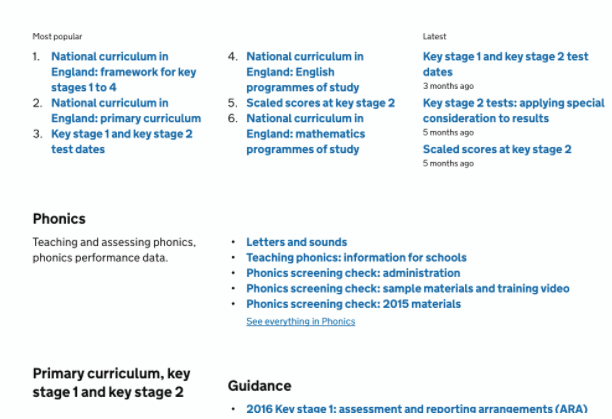
From this round of research we learned it was necessary to break the content down to a more granular level to allow people to skim faster and arrive at the piece of content they needed.
In the second round of research we showed users the revised long list, now broken up into more digestible chunks of content. We divided the content based on what users told us would make sense to them. People reacted more warmly to this, but they still needed to scroll a lot to arrive at the bottom of the page.
Testing two different options
After the second round of research we again sketched several designs, exploring ideas that allowed users to quickly get where they needed to go in the page. After defining hypotheses stating why each design would or would not work, the team thought that the strongest two ideas were an accordion and an anchor menu.
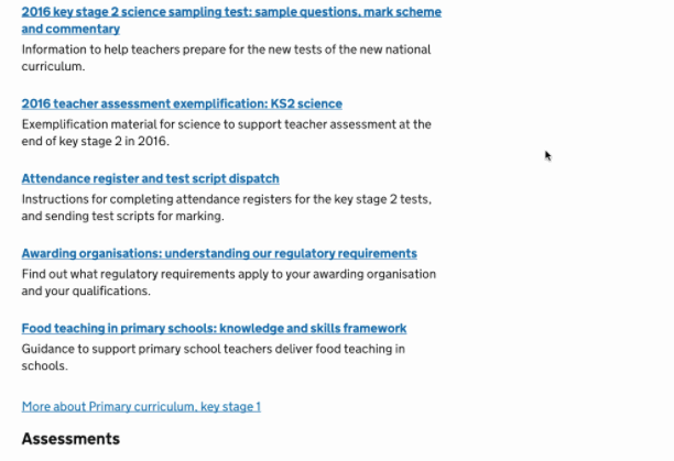
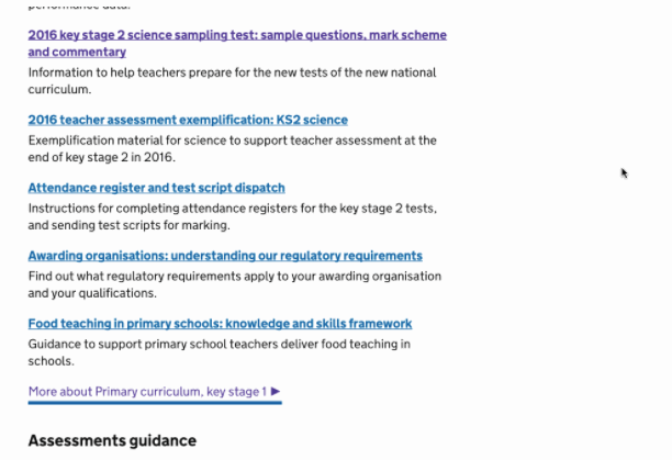
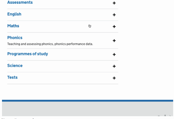
The accordion lets users see all the subtopics in a list and click to open the list in place. Because the user is only loading a part of each page at a time, it is quicker to see what content is in each sub-topic.
The anchor link shows a list of the subtopics at the top of the page, letting users see the content in the topic without having to scroll.
We decided we wanted to test both options in round 3.
As in every other round, we designed 4 tailored tasks and asked participants to find the answer for each task using the prototype. They started do the first 2 tasks on one design, and – without telling them – we switched to the second design for the final 2 tasks.
We followed the same order of tasks, but each session we swapped the design that participants started with. We did this because we wanted to see if task success was impacted by the design itself.
At the end of the session we informed the participants about the switch and asked their opinions about both designs.
Choosing the accordion
For 2 tasks when using the anchor links menu, success was extremely low. This was because the anchor links only showed the first 5 links of the content tagged at that level, so people didn't see there was more content hidden.
The accordion was better at supporting people to quickly check what content sits under each subtopic, without having to click through and waste time. Furthermore, the accordion felt like a much quicker way to have an understanding of the content under each topic.
We chose to focus on the accordion and continued testing. From a couple of other rounds we had some negative feedback about the amount of content sitting under accordion sections. This was particularly true when we ran our 6th round with students with cognitive needs, such as dyslexia, ADHD and autism.
Getting more data
From the rounds of user research we saw how the accordion could help people navigate and understand content more quickly.
We are now tracking the beta to find out how people interact with the accordion to have quantitative data to illustrate or disprove our qualitative findings.
Follow Emma and Giulia on Twitter and don't forget to sign up for email alerts.
Recent Comments