
In the book 'David & Goliath: Underdogs, Misfits and the Art of Battling Giants', Malcolm Gladwell uses the illustration of an Inverted-U curve.
Inverted-U curves are all about limits. They illustrate the fact that “more” is not always better
In my work with the Government Digital Service I’ve focussed a lot on doing less, or making sure we do just enough. When we continuously iterate a product or service there’s a danger that our changes will stop having an impact, or worst, start to have a negative impact on user experience.
This is how an Inverted-U curve works:
Inverted-U curves have three parts, and each part follows a different logic. There’s the left side, where doing more or having more makes things better. There’s the flat middle, there’s the right side, where doing more or having more makes things worst.
Good design needs to recognise limits and constraints. We often try to use design, or design user interfaces to hide complexity. This rarely works unless we tackle the underlying issues - in short, we can have too much design.
An Inverted-U curve for products and services
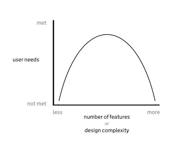
I think this works really well as an illustration for product or service design.
You can compare how well a product is meeting user needs against how many features you’ve built or the complexity of your design solution - this might be the design of your UI or the content design.
The left side of the Inverted-U is somewhere between a minimal viable product and a product that we’re confident is meeting user needs.
We’ll know how well a product is meeting user needs from user research. This confidence should be supported when we use data to measure how easily people can use the product, how long it takes, and how satisfied they are with the experience. Therefore, adding something when we’re in the left side should create value. We’ll know this is true if we see a positive uptake in key metrics like time to completion and completion rates for the service.
Eventually you get into the “flat middle”. This is where features start to make little or no difference to key metrics and the User Experience.
Finally, if you persist in doing more, you might find that you’re adding features that make things worse.
As well as an Inverted-U curve based on user needs, this will also work as ‘how usable a product is compared to the number features it has’, or, ‘the percentage of people completing a transaction measured against the number of features you’ve provided to help them’.
How this works in continuous iteration
If you think about continuous iteration in this way I think it starts to make a little more sense.
Last week we published some of our experiments and case studies for Carer’s Allowance. In some examples, we’ve removed features like progress indicators or smart answers with no effect on key metrics - this is because they’re in the “flat middle”. Experiments to remove features are often driven by insights that suggest they have a negative impact - so are leaning towards the right of the curve.
We sometimes have to take a step back as we understand user needs better. This can mean removing or replacing features to help us move forward. This is moving the product back to the left of the curve where new changes or features will begin to have a measurable effect again.
Sometimes we just need to do less, there are limits to the outcomes of what we can design when it builds on what already exists. The number of features, design or content you need to prioritise when building a digital service all depends on where you are on the curve.
Questions for agile teams:
I think it’s worth asking the following questions of agile teams:
- What if–past a certain point–adding more design, content, or features starts to make things worse?
- What if–past a certain point–having more stakeholders, experts, or analysts makes us understand the problem less clearly?
- What if–past a certain point–adding more security measures, makes things less secure?
- What if–past a certain point–more complexity, leaves the service or transaction more open to fraud and deception?
- What if we made more time to look at our products and services through the eyes of those that experience them and focussed more on removing barriers than adding solutions?
If you’re interested in hearing me talk more about doing less why not come along to NUX3 in Manchester this November.
Keep in touch. Sign up to email updates from this blog. Follow Ben on Twitter.
2 comments
Comment by Mark Hulett posted on
Hi Ben
This reminds me of the 'Fulfillment Curve' from Joe Dominguez book Your Money Or Your Life, it shows the relationship between the experience of fulfillment and the amount of money a person spends, defining ENOUGH at the peak of the curve. With decreasing experience of fulfillment inline with overconsumption at the far right of the curve
Interesting blog.
MH
Comment by Dave posted on
Is there a danger by doing less and then iterating that some things get missed, adding further iterations which could have been avoided?