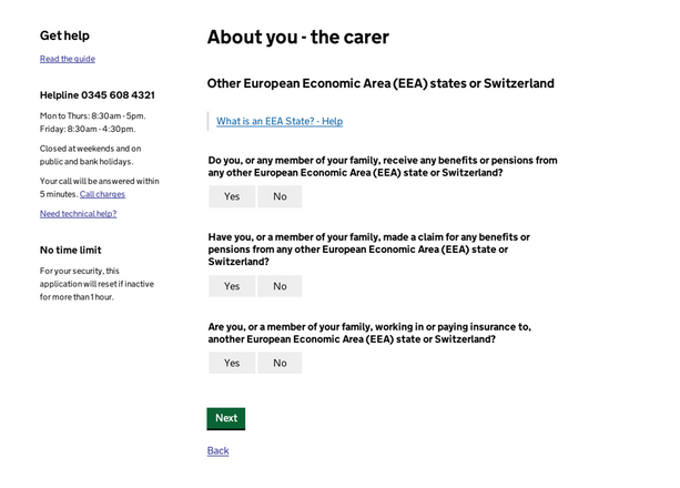
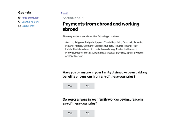
Here’s an example of a change we’ve made to the Carer’s Allowance service to help to make it clearer, faster, and simpler for users.
Example: European Economic Area questions
I’ve been working on the Carer’s Allowance service for about 9 months now. I still don’t understand what the European Economic Area (EEA) is. I also don’t understand why Switzerland is added to the mix. Most people we meet, while doing user research, don’t seem to know either.
In user research, we’ve found that most people could eventually answer questions about the European Economic Area themselves. However, they generally had to stop to figure out what was being asked of them.
Basically, people weren’t understanding what the EEA is - it turns out they could understand the question better without us explicitly mentioning EEA at all.
We’ve also seen this when we’ve been observing our assisted digital research, where carers organisations have been supporting customers face-to-face in using the digital Carer’s Allowance service. People get confused and will turn to the advisor for help and reassurance.
Understanding what we really need to know
Having worked with the Carer’s Allowance Unit, and because we understand how we use the answers to these questions, we established that what we really need to know is this:
Have you received any benefits from, or worked and paid insurance in, another country?
In user research, we’ve observed that people will sometimes guess or answer incorrectly when they don’t understand the question.
What we did
User research is a team sport
We’ve worked with business and policy colleagues to seek agreement to change this question to something that people can answer.
It’s helped that our business experts are attending every one of our research sessions and have seen the evidence for themselves.
We’ve also had policy colleagues attending sessions, so they too have seen the issues people face.
After all, user research is a team sport.
We made a simple change to the title of the question
We changed the question from, ‘European Economic Area states and Switzerland’ to ‘Payments from abroad and working abroad’.
We now include a list of all the countries the questions relate to, to make it clear what we’re asking about. We used to include these as a show/hide help foldout, but data was showing that most people weren’t selecting or reading this information.
What we’ve learned
By testing this new solution as part of our user research sessions, we’ve found that people can understand these questions more clearly and spend less time on this page.
We could have tried to explain what these questions meant by adding more help explanations, but a better solution was to ask the questions differently.
This will shortly be a change that we make to the live Carer’s Allowance service. We believe that this will make people answer these questions more accurately, having understood what’s required more quickly.
We've now delivered the story, not only to reduce the questions down to two, but also to deliver a change in wording that makes a real difference to users.
Keep in touch. Sign up to email updates from this blog. Follow Simon on Twitter.


2 comments
Comment by Dominic Hurst posted on
Great example of a common sense solution by removing un-necessary (often internal) terminology. I'm sure this had an impact on form completion rates and time spent by all parties if they had to re-submit it.
Comment by Simon Hurst posted on
Thank you for the feedback. The impact is something we are currently tracking with our analytics. My colleague on Carer's Ben Holliday has written a great post about how we do this on Carer's.