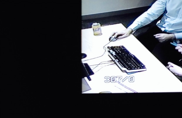
When we built our user research lab, we avoided putting white work surfaces in the research space as much as possible. This is because white surfaces glare.
White is at its worst when it has direct light shining on it. In relative shade, it's only marginally better.
Glare causes 3 problems:
- Glare is hard on your eyes. As you can see in the photo above (taken in the observation room of an external lab), the screen shines white. For most people, but particularly if your eyes are sensitive, staring into glare for hours can cause discomfort. Also, detail is harder to make out. This can tire observers unnecessarily.
- Cameras can't hold focus on glaring surfaces, especially if lighting is uneven. This means your observers won't enjoy crisp and consistent image quality. In turn, the quality of your video footage won't be great either.
- Cameras tend to compensate for glare by lowering exposure levels. This makes for a dark and fuzzy picture quality.
What happens when you mix white and sunlight
Here's a 15-second video clip. It's a sunny day in our lab and our usually-sharp camera is trying to focus. This was an unusual session - a paper card sort on a white-topped table - but it proves the point.
Our Studio Manager is trying to improve the picture. As he tips the camera up and away from the glare, the picture clears and almost focuses. As he tips the camera down, the screen goes dark and focus is lost.
(Note: for privacy reasons, this video has no sound.)
We built for the observers experience
When we built our lab, we placed a good deal of focus on creating an observation space that's welcoming and social (here's why), and which considered the experience of the observers.
We aimed to create a space in which observers could stay for hours at a time, without feeling irritated or stressed. Making sure our screens are set up right - that images are HD crisp and glare is minimised - is an important part of that.
The furniture you put in your research space will have a direct impact on the experience your observers have. If their experience is one of glare and fuzz, they won't be encouraged back. Without the steady traffic of attentive observers, your lab will soon lose its 'soul'. Getting team members into a space to gain direct experience of their users is one of your primary goals.
What to choose instead of white
Choose light but not white
When we furnished our lab, we chose light grey and matt work surfaces.
I can't claim we avoided white entirely - our walls are white, and our coffee table and credenzas are white. We did however make sure that all working surfaces were matt and not white. It was a worthwhile detail.
You could choose wood veneers, neutrals, pastels, browns, greys, even black. Though, I recommend steering away from dark and bright-coloured work surfaces. Even if cameras don't mind them, simple and neutral works best.
Choose matt
Matt is important. Again, you really want to avoid all kinds of glare and reflection, at least on work surfaces.
Install good blinds or curtains
Last but not least, if your room gets direct sunlight on work surface areas, install blinds or curtains. This is essential if you're going to manage glare.
Get good and even lighting
To make the most of video quality, invest in good quality lighting. We didn't think about lighting when we installed our lab. It's a detail thing, not a game changer, still, next time round, it's something I would give more time to.
Keep in touch. Sign up to email updates from this blog. Follow Kate on Twitter.
Recent Comments