At Ofsted, we have been redesigning our registration services. Among them is the registration service for children’s social care services that we regulate, which includes a form called SC1 - become a children’s social care provider.
This form has recently been revised (and the service renamed Apply to register a children’s social care service), but even after undergoing major improvement it was still 120 pages long with complex routing.
Simplifying this form was challenging. There are six distinct types of user who might use it, and each of these users can apply either as an individual, an organisation or a partnership, meaning that in total there are 18 different journeys a user could potentially take through the forms.
This complexity posed a real challenge when deciding how to take notes during the remote usability testing sessions and conduct the subsequent analysis.
Possible approaches
We are a team based across Ofsted’s Manchester and London offices, so traditional note taking and affinity sorting with sticky notes was not possible. (Sticking up 120 A4 pages of screens would have been a particularly unenviable task.) As we also needed two screens and somewhere quiet to conduct the sessions, we decided to work from our respective home offices.
Previously when we have conducted user research on shorter registration forms we used screenshots of each page of the form and placed it into a Google document or spreadsheet. We then used the comments function to insert raw data. These comments were then used to conduct affinity sorting.
As this form was particularly long, with users often jumping between questions, going from, say, question 45 to question 61, keeping up would have been difficult to do in a Google document.
A new collaborative approach using a prototyping tool
The content designer on our team, Mukesh Singh, with support from an interaction designer, used a prototyping tool (Balsamiq) to create wireframes of the service start page, all the pages in the transactional service, and the email confirmations. They then invited subject matter experts (SMEs) and other designers to pair-edit the wireframes.
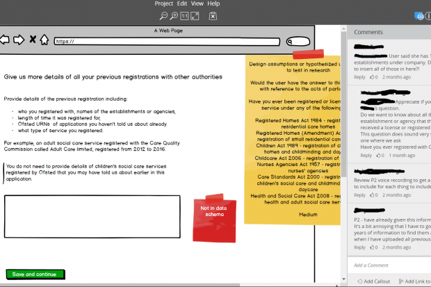
As both the content and design were in one place, they used the sticky notes feature in the prototyping tool to share the design assumptions they had made as well as their user needs hypotheses. These helped greatly when planning the research sessions.
To help us take a more collaborative and holistic approach to recording and analysing research findings, we decided to record data from the usability testing tasks directly into the prototyping tool. This also allowed us to conduct affinity sorting within the tool. To make life easier, we ensured that page numbers were left on the prototype (discreetly) so that it would be easier for note takers to move to the correct page in the prototyping tool and take notes in the comments boxes.

Strengths of this approach
- The right hand column of the prototyping tool allowed us to quickly jump between pages of the form.
- Using the tool for affinity sorting meant that we could also see the discussions taking place between other colleagues, for example between the policy and design teams. This allowed us to make more informed decisions.
- We could quickly see who had placed each digital “sticky note”, which was useful when further explanation was needed during or after our analysis session.
- We could immediately make changes to the mockup and assign them to the appropriate person in the tech team to update the prototype.
- Using the tool meant we had a clear trail of all the decisions that had been made on the form based on user research.
- The entire mockup, along with sticky notes, can be exported as a PDF. This was useful when sharing with other members of the team.
Limitations of this approach
- The mockups need to be created in the prototyping tool. For some teams this may mean additional work.
- Some prototyping tools allow you to export all comments and notes. Balsamiq has two features that could be used for notetaking: comments and notes. The advantage of using notes is that when you export the mock up as a PDF, the notes also export with it. This means you have a comprehensive record of the research data. The disadvantage with notes is that only one person can use the note function at any one time. This can be problematic if you have two note takers, as we did. To get around this, we decided to use the comment function to take notes instead, even though this meant having to manually add all the raw notes into the exported PDF.
- Depending on how large your project is, the prototyping tool may take a few minutes to load.
- The cost of the prototyping tool.
Final thoughts
We gathered over 60 insights from this round of research, and made around 50 content and design changes to the prototype.
As a team we felt using a prototyping tool helped us to meet our user needs in several ways. It empowered us to holistically plan and edit the design and content in every step of the user journey, and having all the content, design and user research feedback in one place allowed us to compare the content and design, optimise it for consistency, and act quickly on our research findings.
For us, the prototyping tool was a truly versatile, user-focused design tool that we will be using in user research again, especially when our registration forms are so complex.
Have you used a prototyping tool to record research data or analyse research? Let us know in the comments.
5 comments
Comment by Lewis Kang'ethe Ngugi posted on
Wow... I didn't think teams still use Balsamiq. I'm curious, did you use Balsamiq cloud or the Desktop version?
Comment by Salma Patel posted on
Hi Lewis,
Thanks for your question. We used the cloud version and it worked really well for us. It takes a few seconds longer to load than a normal webpage, but once it has loaded, it works very smoothly.
Thanks
Salma
Comment by Rinto posted on
I wonder how you managed to create all these assets for the form(radios etc.). Are they reusable. Have you thought of using Axure and if you have, would be interesting to hear what made balsamiq the choice.
Comment by Salma Patel posted on
Hi Rinto,
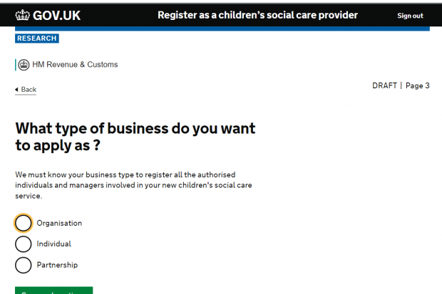
Thanks for your question. I haven't looked into Axure but I will look into it. The designers were already using Balsamiq and had a license, so we went along with that. There is also a gov.uk balsamiq kit which made it really easy to develop the forms. I can send it over to you if you want a copy (my contact details are here: http://salmapatel.co.uk/contact/)
Best wishes,
Salma
Comment by Charlie Reynolds posted on
Thanks, sounds great! My hack has been to use Steps Recorder and OneNote to grab screens/keystrokes and co-author.