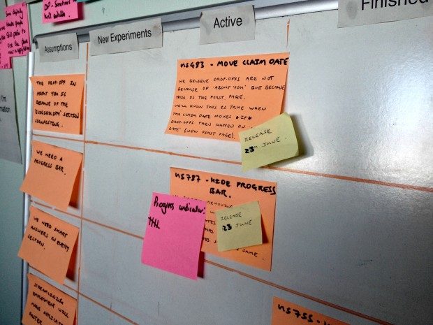
Data shows us what’s happening in a live service. By using data, we design user research that helps us understand why it’s happening.
When we design digital services, we start by making assumptions about user behaviour and what people need.
When we iterate, we're able to test our assumptions as ‘experiments’, using insights from user research.
At the moment I’m working on Carer’s Allowance and we iterate the service every sprint - in our case, every 2 weeks.
Define outcomes and write them down
To deliver user stories that help meet user needs, focus on outcomes.
When we change something on a live service, it's important we understand our expectations of what will happen.
If an experiment doesn’t produce the outcome we expect, we can try something else. We can iterate until, ultimately, we’re meeting all the user needs for our service.
I’ve found that whether we articulate outcomes or not, assumptions exist in teams. It’s important to write assumptions down and test them. This works on the basis that the first idea we have, or the first thing we do, is likely wrong.
What we mean by ‘experiments’
An experiment is when we:
- Write down an assumption
- Define a hypothesis. This is how we plan to test the assumption, usually based on changes from 1 or more user stories.
- Make the change to the live service
- Measure the outcome of the change using key metrics
How we approach experiments
After each experiment, we discuss the outcome and agree what to do next. This informs, and helps us prioritise changes we make to the live service.
We consider all changes to the live service very carefully. We want to prioritise changes that we’re confident will improve the service based on what we’ve tested and observed in user research.
We usually look at data 2 weeks before, then 2 weeks after a change has been made, or until the next release.
6 case studies that show how this works
The following 6 case studies show changes we’ve made to the service as part of separate releases.
1. Completion rates: Smart answers
This feature shows the completed pages in each section. It’s designed to make it easier for users to go back or change previous answers.
Assumption
People need ‘smart answers’ to help them complete the application.
Insights from user research
Some users were frustrated because ‘smart answers’ only let them view or change the answers for questions in the current section. The application had too many questions to show all previous answers consistently.
Single page ‘sections’ didn’t show this content at all, which caused confusion.
People with less online experience sometimes thought these were new questions or got stuck trying to interact with the content.
Experiment
We believe that removing ‘smart answers’ will not affect completion rates. We’ll know this is true if completion rates stay the same after we remove them.
Data
Completion rates stayed the same after we removed all ‘smart answers’. The average time to completion and the total amount of claims online also stayed the same. We haven’t seen any increase in time outs or noticeable changes in user behaviour, for example, people using the back button.
What we learned
This helped us confirm that most users expect to check their answers at the end of the application, not as they progress through each section. People don’t think in sections.
We need to start with user needs before designing solutions.
Update
Since removing ‘smart answers’ we’ve been testing a prototype with a ‘check your answers’ page at the end of the application. We now believe this meets a clear user need - people can check and change their answers before submitting.
We’ve also received consistent user feedback through the GOV.UK user satisfaction survey that confirms this.
I’d like to be able to check the form before submitting.
2. Time to completion: Education
We’ve prioritised a number of improvements in order to improve average time to completion.
We believe there’s a clear user need here:
As a carer I need it to be quick and straightforward to make an application for Carer’s Allowance because my time is limited.
Assumption
The education section is confusing. This makes it difficult to complete an application.
Insights from user research
The education section was confusing people because there were so many optional fields. They weren’t sure which information was really required.
We didn’t think this was enough of an issue to make people drop out but, for users in education, we did believe that optional fields were adding unnecessary time to their application.
Most users were able to understand the questions more clearly and complete the education section faster when we tested this as a single page without optional fields.
Experiment
We believe grouping the education questions more coherently, and removing optional questions will make ‘education’ clearer. We’ll know that this is true if average completion times decrease for applications that include education.
Data
Average completion times for applications, including education, decreased after we made these changes. Along with other changes, this has significantly reduced the number of steps it takes to complete an application.
Since we removed the remaining optional fields or made them mandatory, the information people provide is generally more complete and faster to process.
What we learned
It’s possible to capture better information by asking fewer questions.
Considering the type of questions in this application, it makes sense to group multiple questions together on a single page.
Update
Since making these changes we’ve prioritised a number of user stories to reorganise questions more coherently in other sections of the application.
3. Time to completion: Employment
Assumption
The employment section is overly complicated. This makes it difficult to complete an application.
Insights from user research
We know from observing people completing ‘employment’ that it's the most complex area of the application. It requires contact information, exact dates, and pay details for each employment.
Some users find it difficult to provide all the information required. It’s also not clear what information is required because a number of questions are marked optional.
Data from the live service showed that this section was adding 14 minutes to the average time to completion for people in employment.
Experiment
We believe that reordering the employment questions more coherently and into less pages will make ‘employment’ easier to understand and complete. We’ll know that this is true if average completion times decrease for applications that include employment.
Data
Average completion times have remained the same since we made these changes. We’ve seen a small decrease in the average number of steps taken to complete an application.
What we learned
We didn’t really solve the underlying problems. We did make this section clearer but the biggest obstacles for users still exist, like asking people to find payslips and provide dates from previous employments.
We need to do the hard work to make it simple.
Update
Since this change we’ve done more work to identify changes to the employment section.
We’re removing some optional fields, and making others mandatory where this used to be ambiguous. We’re no longer going to ask (most) people for as many employment dates, especially when these aren’t recent dates or could be difficult to remember.
Finally, we’re reviewing how we contact employers and when we ask for payslips to be provided.
4. Completion rates: Help and support
Assumption
People need help to complete the application. They can’t find support when they need it.
Insights from user research
When completing an application, most people need help with questions relating to their individual circumstances. We know there are significant dropouts in some sections due to specific questions in the application.
Most people were struggling to find the helpline number at the top of the page, which was hidden behind a show/hide link.
Experiment
We believe that moving the phone number to a more prominent ‘help’ column will make it more findable. We’ll know that this is true if call volume increases after we make the change.
Data
Completion rates have stayed the same. We’ve started getting regular feedback through the GOV.UK user satisfaction survey, for example:
I did [need to] contact the help desk. There was a very helpful lady on phone who explained how to get the information.
What we learned
We were providing people with the wrong phone number. Most calls were being put through from ‘technical support’ to the Carer’s Allowance Unit because people needed help with questions or needed advice about eligibility and entitlement.
When people need help to complete an application we should make support options clear. If there’s a clear user need, support options should always be visible.
Update
Since this change we’ve introduced a new help guide with contextual links in the transaction.
We believe this will help more people complete the application. We’re currently looking at this data. So far we believe that introducing a help guide hasn’t increased completion rates.
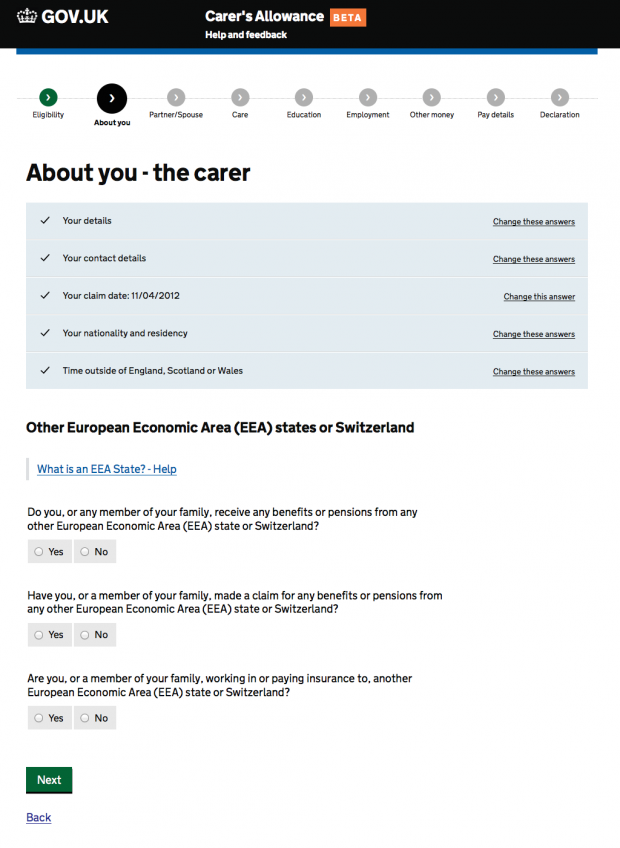
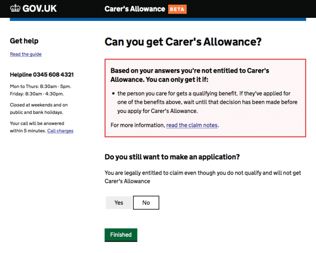
5. Completion rates: Your details
This change was designed to help us understand why so many people (up to 25%) were dropping out at the start of the application, ‘Your details’.
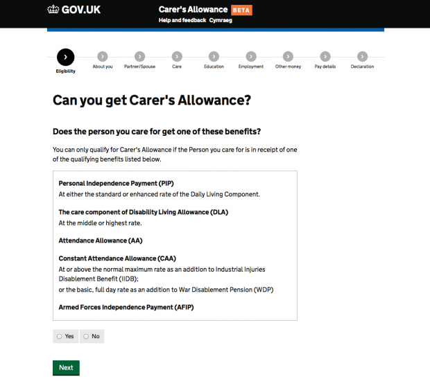
The start of the application comes after a set of eligibility questions, designed to quickly establish if you can get Carer’s Allowance.
Some dropouts are okay. Most people should be leaving the service if they find out they can’t get Carer’s Allowance. This meets a user need:
I want to know if I can get Carer's Allowance as quickly as possible so I don't waste my time making an application.
This was a good example of an easy experiment. We were able to measure changes to dropouts after a change we had already planned - making ‘Claim date’ the first page in the application.
Assumptions
Most people know their National Insurance number. This isn’t why people are dropping out.
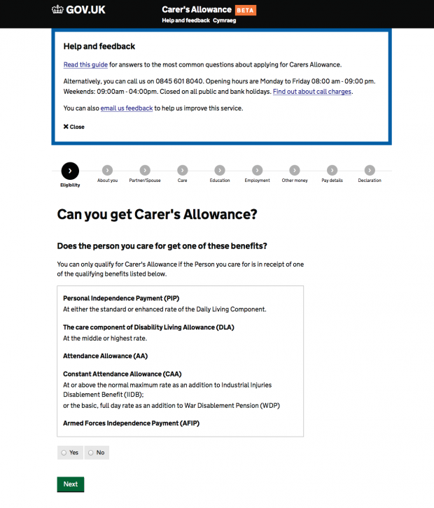
The dropout rate in ‘Your details’ is because of the ‘Eligibility’ section.
Insights from user research
Most people taking part in user research could remember their National Insurance number. If they couldn’t, they knew how to find it easily.
We found that the outcome of the eligibility section wasn’t always clear for users - especially when people were told ‘you may not be entitled’. The only option for them was to select ‘Next’, taking them into the application.
Experiment
We believe dropouts at the start of the application are because of the eligibility section. We’ll know this is true if dropouts stay the same after we move ‘Claim date'.
Data
Since making this change we’ve seen a split in dropouts at the start of the application. Between ‘Claim date’ and ‘Your details’.
What we learned
We’re now more certain that there’s different reasons for dropouts at the start of the application.
We still think this could be because of the eligibility section. We don’t believe ‘Claim date’ is the reason; it only had a small amount of dropouts when it came later in the application.
‘Your details’ is clearly responsible for some dropouts. This could be the mandatory requirement for a National Insurance number, or people realising this is a reasonable lengthy form to complete when viewing this page.
Update
Since this change we’ve made design changes to improve the signposting from the eligibility section. We believe that giving people that are not entitled a route out of the service and back to GOV.UK, will help reduce dropouts in the application.
6. Completion rates: Progress indicator
Assumption
People need a progress indicator to help them complete the application.
Insights from user research
Most users weren’t noticing the progress indicator. When people did notice the progress indicator, they expected it to be navigable (so they could go back and check/change their answers). Some people were intimidated by the number of sections they needed to complete.
We believe that users want some indication of how much work they need to do but we’re not sure if this needs to be specific, for instance, showing individual sections.
Some of the sections also caused confusion because they used ambiguous labels, for example ‘Other money’.
Experiment
We believe that removing the progress indicator will not affect completion rates. We’ll know this is true if completion rates stay the same after we remove it.
Data
Completion rates stayed the same after we removed the progress indicator. The average time to completion also stayed the same while the total amount of claims online went up slightly. This wasn’t a significant increase.
What we learned
Adding features to signpost users won’t always make things clearer. It’s better to remove any features that don’t meet user needs.
Sometimes it’s better to do less.
Update
Since removing the progress indicator we’ve received a small amount of user feedback through the GOV.UK user satisfaction survey, for example:
Show page number. This will help to show progress.
This confirms earlier insights that people just want to know how many sections there are or how many sections they still have to complete. We’ll be adding a solution for this in a future release.
Keep in touch. Sign up to email updates from this blog. Follow Ben on Twitter.
2 comments
Comment by Dominic Hurst posted on
Great post Ben. Using the what (quant) and the why (qual) in perfect harmony. Interesting use of "time to completion" as in general analytics this is a misinterpreted metric. This is less so in forms but you can argue filling it in quickly might actually be bad. In this instance might be best to have a benchmark and try to achieve this?
Comment by Ben Holliday posted on
Thanks Dominic.
In terms of "time to completion" I think it depends on the user needs for the service. With Carer's Allowance we know most carers have limited time to complete an application because they're caring for someone. Improving time to completion won't be a focus for all services.
That said, we're mostly using time to completion as a measure to see if we've made content clearer. When things are clear and easy to understand people should be able to complete a transaction faster - so it's a way of measuring this.