I’m working on Apply for Carer’s Allowance, 1 of 25 exemplar services we’re building as part of Digital Transformation.
A need for reassurance when using government services
Something we’re seeing repeatedly in user research is a need for reassurance when using government services. Despite a lot of good work, this is especially the case when people are applying for benefits.
For example, we’ve met people too afraid to call a helpline in case they say something that could lose them money or delay payments. In my experience, these are people with nothing to hide. They see making an application as something you have to get ‘right’, believing they can’t afford any mistakes.
Some people are too afraid to use a digital by default service by themselves
These are people who might be technically able or confident enough to use a digital service, but the anxiety of these types of transactions means they need reassurance and require additional support.
The cost of this support is often hidden because anxious users will approach other people or organisations to help them through the process of form completion.
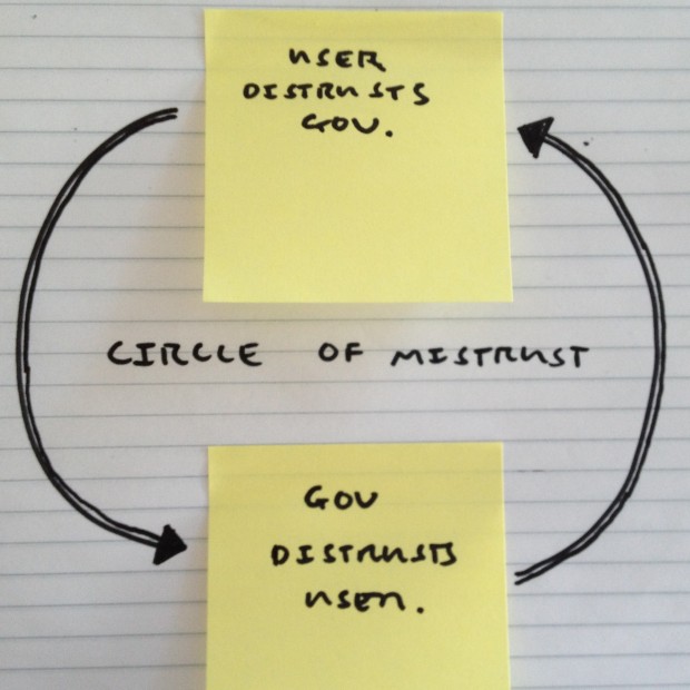
I describe this problem as the circle of mistrust.
A scenario that builds mistrust
If a user is guarded with the information they give, a government transaction might add more questions to try to capture more accurate information. Users are then suspicious of the motivation behind the questions they’re being asked. User distrusts government. Government distrusts user.
If we can find ways to trust users more, they'll have more opportunity to grow in confidence and use digital services independently - all part of building better services.
Here are some of the things we’re doing to build trust
Saying “it’s okay”
Mistrust is often caused by the way we ask questions. We’ve seen that if someone calls for support during a transaction they can be quickly reassured by the person on the helpline.
This isn’t always consistent with how we ask questions in our digital services - sometimes people just need to hear “It’s okay. Give as much information as you can”. This is also why all content should be written in plain English.
Explaining why we need to know
Explaining ‘why we need to know’ is really important. The most common question we hear from users is, “why do they need to know that?”, usually followed by, “I’d have to speak to someone” or even, “I’d give up”.
The thing Carer’s Allowance users worry about most is how it might affect other benefits they already get, or even the benefits of their partner or the person they care for. This really matters when their household could lose money.
We believe this is why we see lots of people incrementally dropping out during application - you can see this pattern on the Carer's Allowance performance platform: users at each step (Ed: Sorry, link no longer exists). We’re trying to address this is by being much more open about why we’re asking.
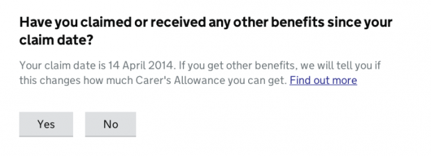
A new help guide has been written to explain why we need to know. For example, we now explain why we need to know about ‘other benefits’.
4-5% of users were dropping out of the application when they got to this question. Based on research, we think users were worried about what would happen to 'other' benefits' if they answered, "Yes".
Think about how frustrating this must be - spending 20-30 minutes completing the application, then trying to determine the impact of this question only to feel you have no other option but to give up.
Avoiding ambiguity
We’ve found that ‘optional’ questions confuse most users. They make people suspicious: “Maybe they’re trying to see if I choose to answer this or not?” Most people think it will delay their application if they they don’t provide ‘optional’ information.
To make a decision on an application we either need information or we don’t. So to build trust, make things mandatory or don’t ask at all.
Designing a declaration based on trust
Research shows that people drop out around the declaration page. Again, this is when they’ve already put in the time and effort to complete the entire application - we think they might be dropping out because of mistrust.
The user need for a declaration is to declare that:
- I’ve checked and the information I’ve provided is correct.
- I’ll tell you straight away if any of this information changes.
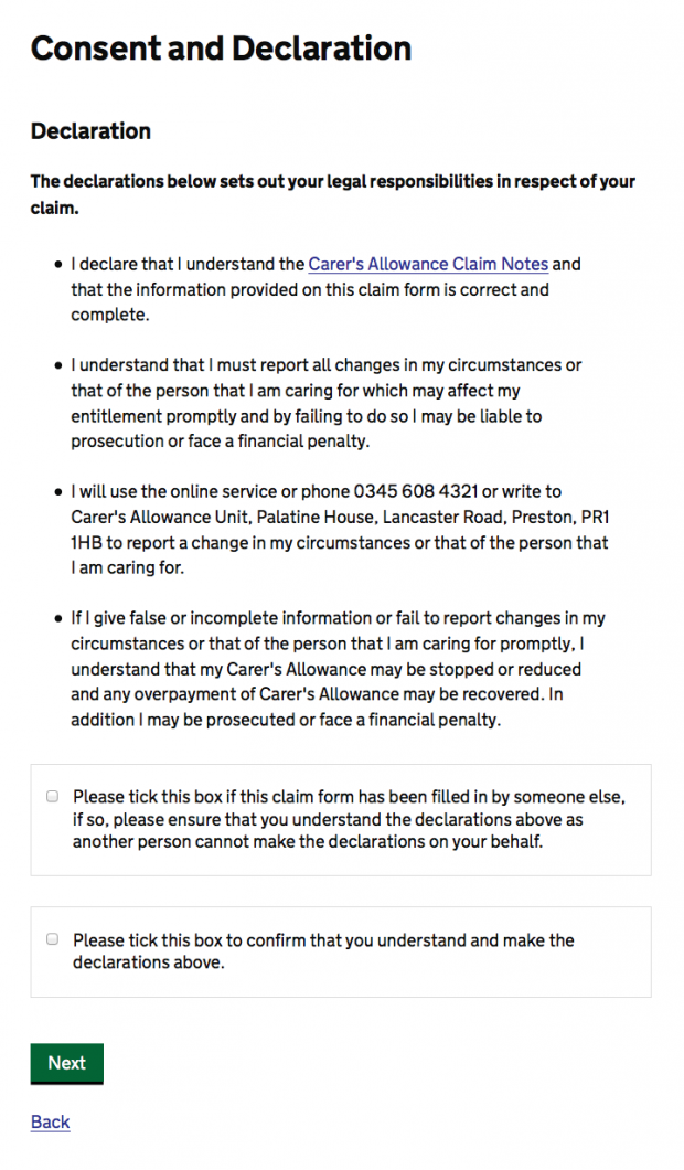
The live declaration page for Carer’s Allowance (below) is more complex and can be intimidating. People we’ve tested the service with describe this page as 'legal' and 'scary'.
Repeating the same information adds to mistrust. In this example, in bullet point 2, "I must report all changes in my circumstances" and bullet point 4, "or fail to report changes in my circumstances".
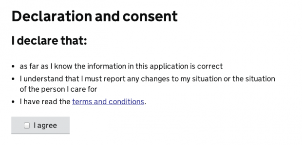
The Carer’s Allowance team have now started testing a new version of the declaration, which we’ve designed to help build trust.
If people don’t drop out of a digital transaction they won’t need support from elsewhere or default back to a more costly paper form. Trusting users might mean more people will report changes in the future or use more government services independently.
This is what it means when we talk about: Trust. Users. Delivery.
Keep in touch. Sign up to email updates from this blog. Follow Ben on Twitter.


13 comments
Comment by Jake Benilov posted on
Ben, the redesigned declaration form seems simpler at first glance, but what's in the 'terms and conditions'? Is it the same information that was in the original declaration, and if so, is this redesign encouraging users to progress through the transaction at the expense of signing something that they haven't read (like bank account / iTunes fine-print)?
Comment by Ben Holliday posted on
Hi Jake. That's a good point – it shouldn't be the same but this isn't a final solution yet. The terms and conditions is something we're still looking at. These are called 'claim notes' at the moment which are ambiguous – a combination of help and policy/entitlement information. To start to address this we recently created a separate 'help guide' which is now live. We present most information in plain english upfront on GOV.UK. There's also a separate disclaimer in the transaction that covers information in the claim notes/T&C's - we're now testing showing this upfront rather than at the end of the transaction – people want to know this information before they start.
Comment by simonfj posted on
Nice one Ben.
This really is the crux of the potential success of the gov.uk's self-serve approach isn't it? Trust in both directions.
It just strikes me as strange as you've made the comment, "We’ve seen that if someone calls for support during a transaction they can be quickly reassured by the person on the helpline". So we know that with all of these services there will be a need to reassure and educate people into a new (self empowered) culture.
Why wouldn't you - as any one being educated in an online course, or using a piece of software these days would expect - have a link down the bottom of the page to "support forum" or online help; a place where people can go through previous Q&A and communicate about their concerns (with people in the same position)? Or book in for a short course?
You'd appreciate (I hope) that we have a change from "contact centers" to "collaboration center". So the principle of "delivery" is outdated. These days it's "share". Or, to put it another way. http://www.thedialoguezone.com/blog/dont-cascade-think-infusion-instead
Tea doesn't appear to be served yet on GOV.UK 🙂
Comment by Ben Holliday posted on
Thanks Simon. We've recently developed a help guide – written in plain english to answer the common questions people call about. This is now available throughout the transaction. We're also testing other ways of providing support like 'live chat', as part of our user research sessions. We're already finding some people are more comfortable interacting with 'live chat' than calling for help.
Comment by Stephen Gill posted on
Hi Ben, and thanks for this thoughtful post.
I'm a content designer working on some of the other exemplars, and just wanted to share a couple of things that I think have helped make services a little less intimidating.
1. I especially like the work you've done on simplifying the declaration. Might be worth looking a whether you can use GOV.UK design elements to help make things even clearer. For example, the declaration on 'Register to vote' looks like this: https://dchtm6r471mui.cloudfront.net/hackpad.com_RB89Ux2CqUn_p.97266_1402576731980_undefined
I think wrapping the 'legal' information in a warning-style callout makes it easier to read than if it was presented as a single block of text.
2. When users hesitate during a transaction, I'd say that contextual help works better than a separate, static help guide. That way you're delivering the help at the point of user need, and minimising the amount or reading and understanding they have to do - which is especially important if the user isn't that confident about the process in the first place.
Static guidance tends to have a lot of the same problems as FAQs: https://gds.blog.gov.uk/2013/07/25/faqs-why-we-dont-have-them/
Comment by Ben Holliday posted on
Hi Stephen, Thanks for sharing these examples.
RE: #2 'contextual help works better than a separate, static help guide'. I agree in principle. We've tested this both ways and we're not sure what works best yet for Carer's Allowance. The live data we're now getting is helping us learn if a separate guide actually helps more people successfully complete a transaction – so far it looks like it doesn't.
The reason we kept this separate is that the information in the help guide isn't relevant to everyone – it depends on your individual circumstances. Including all the help guide as contextual help could be overwhelming for users. We've also tested help-outs in the past which didn't seem to work that well either.
We've now switched our attention back to why we need some of this help information at all. We're working to remove some of the questions that create the need for contextual help – some of them probably don't even need to be asked, or we think that there's better ways to capture the data.
Comment by simonfj posted on
Many thanks Ben, Stephen,
We can't argue that all online help these days is context sensitive. MS and every other software designer has taught as that. And the tool preferred for every user, for their "real time" support in using a single service, is bound to diversify over time as the technology progresses - phone, chat, WebRTC, etc.
But I'm looking at that post it note above & thinking from the "Digital Inclusion" team's perspective. So I'm looking at GOV.UK from this page's perspective. https://www.gov.uk/government/get-involved Getting people into an online culture, regardless of the publisher, is a matter of orientation.
GOV.UK is a biggie, with lots of editors off working on very different services and publications; all (now) with the same masthead. I'd better give you this conversation for a context. http://lnkd.in/bFnzSby
So, as far as what's external facing, it's OK, even if it is primarily brochureware. We're lucky. We've happened to have found one another, and can talk about improving a service/standardizing services, simply because we we know blogs are a way to engage. What do you might think would happen if we we're to link from https://www.gov.uk/carers-allowance/how-to-claim to a "Carer's support forum" or to a "service designer's forum" ? And so on, for every service. We'd (e.g.) have this conversation in its rightful context.
We'd also have the opportunity to look at a service, end-to-end, from a user's perspective. Just one e.g. The "renew your passport" service works fine. But how might a user suggest that HMPO could save half their fedex bill, by posting a new and old passport together rather than separately?
Anyway, would you mention this conversation when your team/group gets together next? This conversation has been going around a while https://insidegovuk.blog.gov.uk/2014/04/03/your-new-favourite-group/#comment-4688 It's a little tiring (for an old user/editor) when people look at a publication like GOV.UK or Wikipedia and don't know that there is a huge amount of communication going on which makes it work. https://lists.wikimedia.org/mailman/listinfo
We can't "reverse a circle of mistrust". Same prob, different direction. We have to make both arrows point in two directions.
Comment by Rohan posted on
Hi Ben.
A very interesting post and I will point others towards this post. It's a neat summation of a lot of excellent principles and Simon/Stephen's posts add to that.
To play devil's advocate. Have you put in place any evaluation of the different versions? Whether "trusting users might mean more people will report changes in the future" is a quantifiable question.
As a behavioural scientist working in Government we are getting involved with a lot of related discussions. For example there is a current discussion on the interaction of user-centred design, data/risk rules and what academic research tells us about increasing honesty in digital services. That covers choices on radio buttons, pre-population of data, when to deploy additional requests for information and how to best design (simple) declarations. That's not to say recipricol trust and fairness isn't part of the literature - more that it's part of a wider evidence base.
At present I think we are sometimes in danger of being focused (to the exclusion of other things) on qual user testing, inbound (non-digital) contact costs and drop out rates. I'd prefer adding a broader focus quantitative study of these factors plus other metrics such as medium term fraud/error and customer behaviour.
All of this can be studied together through A/b testing (with the right metrics) or through alternative means. I'd argue studying a wider spread of behaviours doesn't mean we don't trust customers - it does mean we can take a data led approach to key questions.
I'd be interested in your views?
Comment by Ben Holliday posted on
Thanks Rohan. My view is we should be using data to validate hypotheses from user research. We can do this by focussing on key metrics and making changes that we can measure. For example, adding a help guide is a story we delivered based on the hypothesis: “We believe that introducing a help guide will help more people complete the transaction. We’ll know that this is true if completion rates increase after the help guide is introduced". We're also trying to look at data that shows whether support calls increase or decrease depending on how you improve or make changes to the transaction. I'm going to write a separate post about this and publish more about some of experiments we've run as part of the Carer's Allowance project.
Comment by Rohan posted on
Thanks Ben. That's great and I look forward to hearing about what you found.
I'm a big adovacte of the type of experiments you describe. For example I think we should be patching digital transaction data (where we have an identifer) back across to the inbound call data at individual customer level (doing the matching in bulk). Then with A/B testing or evaluation of the public Beta we can answer the hypothesis as to whether use of a digital service reduces the probability that a customer calls us. Given assumptions in business cases often are that digital transaction is a perfect substitute for inbound contact this is a crucial hypothesis to test. Where there isn't an individual indentifier in both the digital and inbound call data there are other ways to approach using call demand data.
My original post took this a step further in describing also looking at fraud and error behaviours which will undoubtably be of interest to transactional departments.
Comment by simonfj posted on
Thought you might like these 7 deadly sins (of user research),
https://www.youtube.com/watch?v=sS81W1xHuVw&feature=youtu.be
Comment by Steve Holden posted on
The "Carer's Allowance performance platform: users at each step" link above is broken
Comment by Kate Towsey posted on
Thanks Steve. I see that the resource the broken link was pointing at is no longer online. I've put an editor's note in the post to acknowledge that. Appreciated.