I've been working with our content designers to refine content that explains the Identity Assurance service.
We wanted a simple way to understand if our content inspired confidence in users or not.
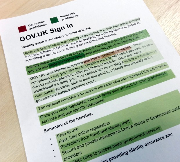
A simple technique and how it works
At the end of each regular user research session, I asked the participant to read a print out of content. I then asked them to underline things that made them feel more confident about the service in green, and things that made them feel less confident in red.
At the end of the research day, I highlighted every underlined sentence with a matching colour. Once I'd done this for all the participants, we could easily see how the text made people feel.
Darker green showed text that made people feel confident. Darker red showed text that made them feel less so.
How it helped us
The technique is quick and easy. It allows the content team to immediately understand the impact of what they're writing. We're learning how to describe our service in a way that’s clearer and simpler. We're now able to make content choices that, through user research, we know benefits our users.
Keep in touch. Sign up to email updates from this blog. Follow Pete on Twitter.
10 comments
Comment by Candy posted on
A fantastic idea that is easily executable with tools we use daily.
Would you also use the results to inform content order/prioritisation on the page?
Comment by Pete Gale posted on
So far we haven't used this for content prioritisation, but it's an interesting idea.
Comment by Tomasz posted on
Indeed very simple and effective technique. It's another example of how the very basic techniques can produce such an amazing effect.
Something I will most definitely use in the future.
Thanks guys and keep up great work.
Comment by Martin Storey posted on
Excellent.
I've been doing “Red Pen, Blue pen”,for a while, most recently with my paper prototypes on Pension Guidance. Overlaying the data is a nice twist.
It changes the dynamic of the session. Being given a pen (rather than a mouse, or being asked to talk) is very direct, and has the effect of putting them in charge. They tend to say things like “Now I'm the teacher”.
Comment by Michael Williams posted on
User feedback about a printout won’t necessarily reflect what they feel about the online experience – but I’m sure it’s useful. Comparing their after-online and after-printout confidence ratings might be interesting.
Anyway, “certified” has certain negative connotations and people will wonder how it’s certified. Why not “government-approved”?
And convoluted 33 word sentences don’t instil confidence – see “Once they have established...” The GDS limit is 25 words – https://insidegovuk.blog.gov.uk/2014/08/04/sentence-length-why-25-words-is-our-limit/
Comment by Pete Gale posted on
Michael, you're right that testing a printout like this may not reflect exactly what someone feels about a digital process, but with good moderation, it can be a cost effective way of getting very close.
In this case, we were testing an early iteration of copy for a briefing pack for our stakeholders. Our need was not to understand how the copy would work in a particular channel, but to ensure we described the service in a way that was reassuring to our users.
Comment by Robin Carswell posted on
We should build this into a tool usable across the GOV.UK digitally.
Comment by Steven Wall posted on
A bit late to the party, but I wanted to say thanks, Pete, for a simple and useful technique.
I will say that, beforehand, I was very sceptical. I had seen a similar technique of giving the participant in a usability session a couple of pens really abused as a way to get data e.g. give the participant a print out of a prototype screen and ask them to highlight what they "like" in a green pen and what they "don't like" in a red pen. Which is complete nonsense.
I like the way your technique framed the exercise specifically around content and as "inspiring confidence" or not. I think in our research this really helped us to elevate the quality of the data we obtained above simple opinion gathering or preference, and the follow up discussion was especially valuable for getting insight into how the content affected the user's confidence in our service.
Comment by Carol Butterfield posted on
Great example Pete.
I sometimes find it useful as an aid to cognitive interviewing in Discovery to see how the user sees and uses existing content (and the relative value of individual elements) Vs their needs and mental models.
For insightful fun, in the private sector I've had Stakeholders and Users do the same basic red/green exercise and compared the results 'game style' in stakeholder sessions. This has allowed us to explore the gap between stakeholder/organisational and user needs/goals and language. It's often been quite revelatory for everyone.
Comment by John Waterworth posted on
That's a great tip.