Earlier this year we released the ‘Services and information’ page, a new way to access all services and information published by an organisation on GOV.UK.
It’s a new design, and we tested a few iterations of the page both remotely and in the user research lab. In the user research lab, one of the techniques we used was unmoderated research with eye tracking.
What is unmoderated research?
Think aloud is a research method in which you ask someone to talk you through what they're thinking and doing while using a service. It's a great research technique but it introduces an additional cognitive process to the user’s activity, which isn’t normally there. Complementing think aloud with unmoderated research is one way to redress that balance.
During unmoderated research, you leave your user alone in the research studio with a series of tasks and observe what they do from the observation room. Participants typically don’t think aloud during unmoderated research, talking to an empty room would feel strange.
The advantage of this approach is that you can get closer to how the user might behave when they’re interacting with the service on their own.
Unmoderated research also works well with eye-tracking. Eye-tracking technology enables us to see where a user is looking and how they scan information. This helps us capture more of the user’s subconscious behaviour as they look at the screen.
We used this technique to test the Services and information page design
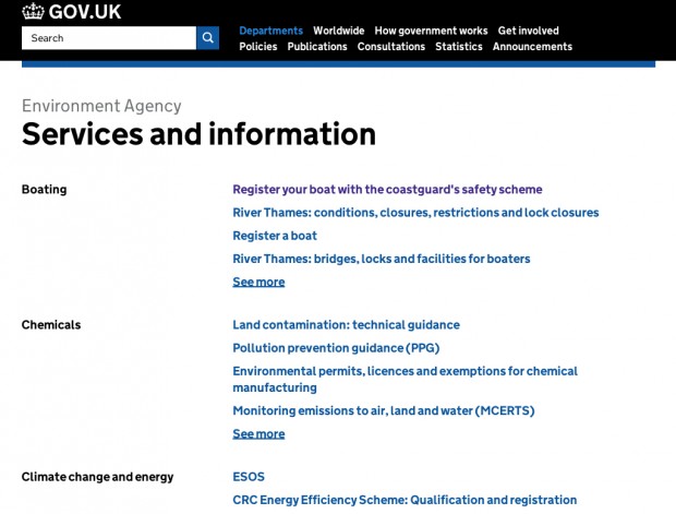
We introduced a new design on the Services and information page. Topic headings are listed on the left-hand-side and, on the right-hand-side, we list the 4 most popular links for that topic. If there are more than 4 links in that topic a “see more” link is added.
We wanted to test our hypotheses
- If we show content associated with a topic, users will have a better idea of what that topic is about.
- This will work better than just a topic heading.
We wanted to observe how users interacted with this page to prove or disprove these hypotheses.
Unmoderated testing with eye-tracking allowed us to focus on getting answers to these questions:
- Do users notice the headings on the left?
- Do they use the links to help orient themselves?
- Would the cognitive load of having these additional links on the page make it harder for users to navigate to what they need?
What we learnt
Links are the attention currency on a content page
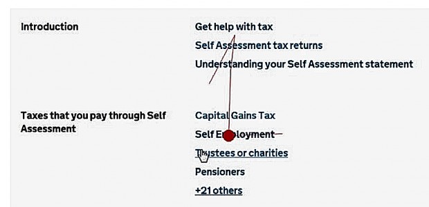
Note: In the images below, the red dot indicates where the user's eyes are looking. The line shows the pattern of their eye movements.
Different users did different things. Some users scanned all the headings on the left-hand-side first, while others only scanned the links on the right. Most users scanned the headings briefly and then settled on the links on the right.
Here are 2 examples.
User 1: gives a little attention to the heading but spends more time on the links as the session progresses
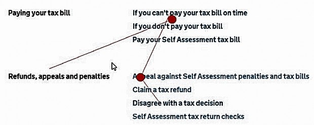
User 2: very little horizontal scanning at all - all attention is up and down the vertical list of links
Overall, we found that the links drew users attention more than the headings. Links are the attention currency on content pages and users eyes are drawn to them.
It was interesting to see how much users relied on the links to decide whether to click on the “+ others” link.
Headings provided visual clarity and context
Although not all users looked at the headings, the design of the page broke up the lists of links so that users could scan them more easily. The headings also provide additional context.
By contrast, when we did moderated research, users talked in greater depth about the headings and appeared to use them more.
The length of the page was less of a problem than anticipated
Including these additional links on the Services and information page makes it much longer. We were worried that this would make it unusable, or that some users would just give up.
During the unmoderated testing we were surprised by how quickly users scanned through the page. The length did not appear to be as off-putting as we’d thought.
Less is not always more: users needed additional context
We compared our research findings to what we’d learnt when we tested pages with just a list of topic headings and no surfaced links.
Users were less successful at picking the right heading to find information without the additional context. In fact having less information on the page seemed to increase the cognitive load - users spent longer deliberating over what each heading meant and deciding which one to pick.
We're introducing this design on second-level browse pages
Since this design worked well, we’ve also introduced it on the second-level browse pages as a way to curate the list of links into meaningful groups. We’d seen evidence in research that users are overwhelmed by long lists of links presented in A-Z order, and couldn't find what they need easily.
We've used this technique on other projects
We also recently used the unmoderated research with eye-tracking technique when we tested changes to GOV.UK’s navigation from the homepage.
Are you interested in trying unmoderated research?
Check out our user research methods hackpad for some tips on how to do this technique in practice.
Keep in touch. Sign up to email updates from this blog. Follow Cath on Twitter.
3 comments
Comment by Mark Hulett posted on
Cath,
Really interesting approach and one we will definitely try. We have tested with a task driven test (no help provided) followed by Think Aloud session but the facilitator remained in the room throughout. As you point out not the same as fully unmoderated so it will be interesting to see how this works out.
Great tip!
Comment by James Low posted on
This is really interesting work. I wonder though, given that the results indicate users read the links to help them choose the section they need and to help them decide whether to click 'more', why it is that the content surfaced in the list of 4 items is drawn from ALL content for that sub-topic and not just content from the dept/org to which the services and info list refers? We've already seen some bad examples of how this can work out on our (HMRC) services and info page - with more popular content from another dept/org filling the short list completely - giving the impression that this is not a list of HMRC services/info at all.
Comment by Cath Richardson posted on
Hi James, thanks for your feedback. This is the first iteration of this page and we are monitoring how it's performing via analytics as well as planning further research. In our first rounds of research, this was not a problem for users but if we find evidence it's confusing people it's definitely something the team will iterate on.