![By Alexander Blaikley (1816 - 1903) [Public domain], via Wikimedia Commons Faraday Michael Christmas lecture](https://upload.wikimedia.org/wikipedia/commons/b/b3/Faraday_Michael_Christmas_lecture.jpg)
In agile, we find that user research works best when we do research in every sprint.
We also know that research only has value if everyone in the team, and key stakeholders beyond, learns from research. That's how we make better services.
I encourage all the teams I work with to have a what-we've-learned-about-our-users slot in the show and tell - or demo, showcase, or review - at the end of each sprint.
To do this, I create a simple 'findings' slide deck. In this post, I'll share how I make them.
I use a simple format
I often have just a few hours to create a findings slide deck for a show and tell, so I use a simple format of:
- a 'what we did' slide
- a set of 'findings' slides
- and possibly one or two 'what we're doing next' slides
For the findings slides I use news style writing techniques.
News style writing
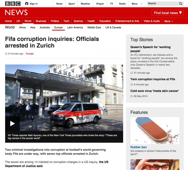
A standard news story has an attention grabbing headline, a lead or intro that states the story's essential facts, one or two nutshell paragraphs that describe the news value of the story, and a relevant and engaging illustration.
Here's an example from BBC News…

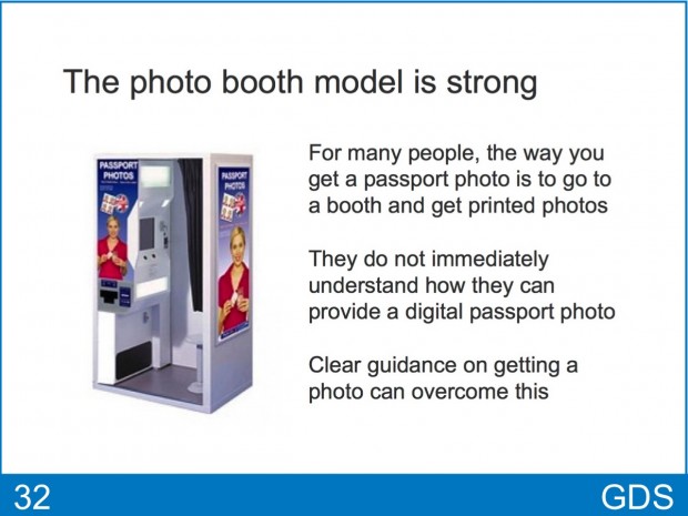
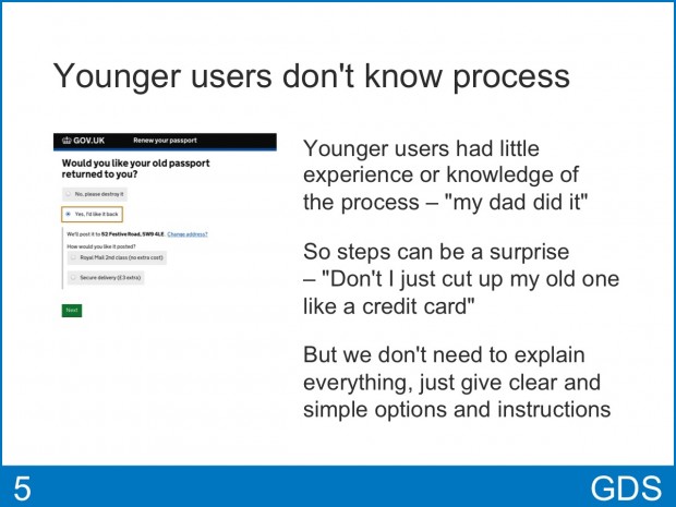
Example findings slides
If you look at these examples of findings slides, you can see the similarity with the new story…


The anatomy of a findings slide
Each findings slide has a heading that's a distilled statement of an important thing we've learned (headline). It then states the essential facts of the finding (lead or intro), explains it's importance and consequence (nutshell), and has a relevant illustration - photo, screenshot, quote or diagram.
Here are my tips for your findings slides.
Focus every finding on your users
I make sure that every finding is focussed on our users - who they are, what they do, how they think, what they need, how they use our service, what happened when they tried our prototype, etc.
5 to 10 findings are normally enough
For a show and tell, 5 to 10 findings are normally enough. So you'll need to focus on what's most important right now. Priority order is okay, but a more engaging narrative order works best.
Put video clips on the next slide in the deck
When I want to illustrate a finding with research video clips, I put them on the next slide in the deck. This is a great way to frame and introduce a set of video clips that would otherwise lack context.
Useful beyond the show and tell
Findings slides, in this format, are easy to talk to and they make taking questions in a show and tell easier. But they can also stand on their own when shared with people who miss the presentation.
Also, as sprints go by, the collection of findings decks provides an easily accessible record of what we've learned about our users.
Keep in touch. Sign up to email updates from this blog. Follow John on Twitter.
2 comments
Comment by Natalie Smithson posted on
Thank you for this, I've been thinking about how to present some of the more intangible work in a show and tell, and this is a good straightforward format. I shall be making use of this info!
Comment by John Beale posted on
Thank you John: clear, clean, simple. 'Focus every finding on your users' is a great tip.