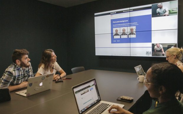
I’m a user researcher working on GOV.UK. When planning user research, we make decisions about how we are going to do it and who with. These decisions impact on what we might learn.
We think about how we can capture the real-life experience of using GOV.UK. We’re trying to make the interactions we see in user research as natural as possible - and reflective of what happens in the wild.
We also think about which users will most push the limits of the products and designs we are working on, and where we are likely to learn the most. Someone using a screen magnifier for example might only reflect the needs of one section of your users, but their interaction may lead you to simplify a design in a way that makes things better for everyone. Not just the over 2 million people in the UK with significant sight loss.
This is why it’s so important that we do user research on a range of different devices, and in particular the devices that our participants actually use in their day-to-day lives. Running research on mobile and tablet for example, rather than just on desktop, means that we see more natural interactions, but we also put our designs under stress that will invariably make them better.
Looking beyond the desktop
One of the things I’ve worked on is benchmarking, which is where we measure how successfully people can complete a set of common tasks on GOV.UK.
We know that only around 50% of GOV.UK users access the site using a desktop computer. The rest use mobile or tablet devices - with mobile traffic accounting for around 40% of visits.
Analytics of actual behaviour on GOV.UK showed that the content for some benchmarking tasks was overwhelmingly accessed by smartphone. For example on the child maintenance calculator 68% of traffic came from a smartphone and only 25% from desktop or laptop. Others showed high use of tablet - for example on check your state pension age 24% of traffic came through tablet, higher than the 10% site average.
While benchmarking is meant to act as a temperature check rather than a total reflection of what users do, the findings clearly pointed to the fact that we should be doing more testing on the devices people use in real life.
Here’s how we do this and what we’ve learned from it.
How we tested on different devices
The team I work started by increasing the range of devices we use when doing user research. Instead of just a desktop PC or Mac, we tried to make sure we had a variety that included a laptop, tablet, Android and iOS smartphones - as well as the option for participant to use their own device.
One of things that we were researching was how users interacted with different variants of the same page. This was part of some work where we were using user research to inform A/B tests that we were running.
On a desktop this was straightforward as we used the GOV.UK Chrome plug-in to select the variant we wanted. However there didn’t appear to be any easy way to do this on a mobile. After some trial and error we figured out that we could send a magic link via a text message to put a participant in the right variant that we wanted them to use.
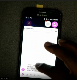
Another challenge that we had was simply how best to do testing with mobile and tablet when in a user research lab.
Initially we experimented with overhead cameras, either using a camera in the ceiling that was zoomed in on a particular spot or using a camera with a flexible mount. These had different strengths and weaknesses. They were great in capturing the interactions, but the flexible camera sometimes got in the way, and it could be hard to see the screen with the overhead camera. For both of them there was the risk that participants would move them out of sight and where the camera couldn’t capture what was going on.
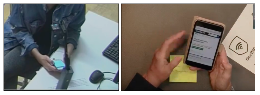
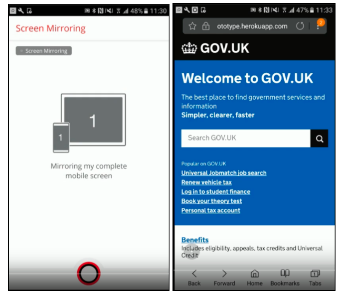
When GDS moved into the new office in Whitechapel, we were really fortunate to gain access to our new user research lab. As well being able to use the 2 purpose-build labs and observation rooms, one of the things that this enabled was the use of a screen-sharing tool that resolved the issues that we saw with our previous approach.
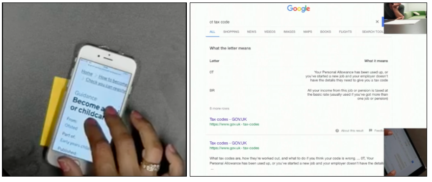
Now we can see the full screen very clearly, and use another camera to look at the interactions or gestures of the participant. It is also very easy to set up, meaning you have less time trying to set everything up with each participant.
A final point around methodology is that initially we picked devices for people to use, so that we got a good mix. Sometimes we switched from one device to another mid-session depending on how the participant got on. These first experiments quickly proved the value and need for more thinking on device.
Two participants in particular were perfect examples of users who wouldn’t normally access GOV.UK on our usual desktop setup:
- a 19 year old who struggled using a desktop, but was very comfortable on her phone
- a 79 year old who only used his phone, and would do everything using voice search through the Google app
However, we realised we were still getting users to use devices they weren’t comfortable with (and so failing on making it as natural as possible). So now, early in a research session, we ask a couple of questions around which devices participants use and in which contexts. This way we can get them using whichever device they feel most comfortable with depending on what task or scenario we put them in - hopefully leading to better research.
What we’ve found
We’re still learning, but these are a few things we’ve found while testing on a range of devices:
- stating the obvious, participants are more at ease and behave more naturally using a device they are familiar with
- initially we only used devices that participants had brought along with them - we then found that as long as the device was similar to their one (i.e. an iPhone, or Samsung) users were happy - using a device that wasn’t their own meant there was no anxiety around what happens if they received a call or message while doing the session
- GovWifi makes it straightforward to connect a participant’s device to the internet if we do need to use it
- the ‘any device’ approach to user research has made it easier for our team to design in a device-agnostic way from the very start, where we have to manage the requirements of different devices they bring together
- there’s a wide range of device behaviour variants which will impact experience of the thing you’re testing - for example, how users click and scroll on a smartphone is different to a desktop - this has been particularly useful for us when thinking about navigation and the amount of content on a page
- context is super important - for example the different behaviour we see between looking up something ‘in-the-moment’, and a user who wants to be on their laptop because they think something will take time and concentration and where they might have to read a lot
- sometimes things go wrong: a screenshare might not work for example, so having the desktop backup is very helpful
Building on our work so far
We know that device behaviour today is a complex picture: many people use different devices interchangeably, and some people will be far more comfortable on one device than another.
Finding out more about how users access our content on different devices will help us continue to improve GOV.UK. That said, we are still learning and exploring about the best ways to do this, so let us know in the comments section about any things you’ve been doing or thoughts you’ve had.
Follow GDS on Twitter and don’t forget to sign up for email alerts.
1 comment
Comment by Ruth Painter posted on
It's good to see the way user testing has been expanded. I have some thoughts after reading this page:
1. Language
Please always remember that the language you are familiar with i.e. regulation or process naming, is often completely unfamiliar to the user, particularly if they are an infrequent user. You know what department names or process titles mean but they are rarely intuitive to people outside the organisation. I've often wanted to comment on pages like this, to explain my challenge, so I wonder if it's possible to enable a 'user comment box' available to the user wherever they are in the site? If a user could comment, briefly, at the exact point they encounter the challenge, & you could capture all that information, it might help you fix issues much earlier in the user experience?
2. Unanswered Questions
There is the option to say whether pages are useful or not but nowhere to record unanswered questions. I've just spent around 20 minutes looking for 2 things: one is whether PIP covers the support I need, the other is how to apply online - it's clear gov.uk only wants people to phone, not apply online, but an online option is mentioned but no link provided. I suffer from anxiety disorder which means I really struggle to use the phone & it might take me months, if at all, to be able to do it. If your site captured unanswered questions you would quickly discover whether there is additional information or access methods you could provide. Most importantly you might discover things you've never even thought about when considering user experience - I mentioned my telephone challenge because this may be something new to your team, where I know many people who struggle with it. You might also consider offering a second part to the comment: 'what would you like us to do about it?' to see if users give you ideas your team haven't previously thought of?!
3. Increasing Online Familiarity
There seem to still be a lot of processes that use paper forms rather than accepting online submissions that could make processes much quicker as well as keeping all submissions & responses in one place. Remember your users are becoming more & more used to the online world! The 79 yr old telephone-reliant user referred to on this page won't be around for much longer; I'm 50 & have grown up with the changing IT world, so when I'm 79 I won't want the telephone option. That's only around 30 years before all those telephone-reliant users are gone. And given how long some of your change programmes probably take, it may not be long before you need to discount some requirements because those users will be gone by the time you can provide them! It might even be more cost-effective to have someone telephone such a user & capture their information into an online form (recording the conversation for more detail if ever needed), than to offer a service that is going to have a declining user base from the moment it's available?