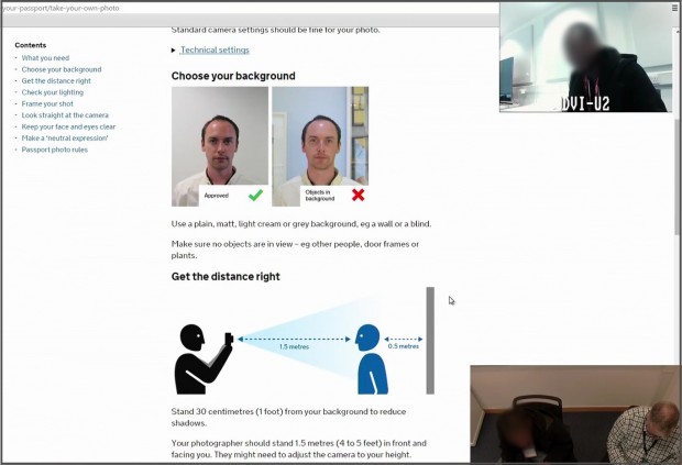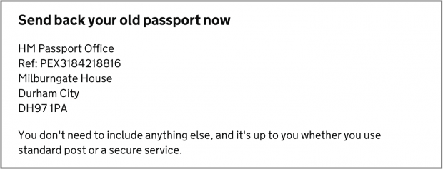
If I had to guess, I'd say that for government services, 60% of our user research and design effort is about the words we use. That's obvious for services that are focussed on providing guidance, but I find it's also true for transactional services.
We listen to our users to find out what words they use. We try out lots of different ways to title content, frame questions, and describe choices. We use specific techniques to test whether people understand our words. We grind away at our words to make them as clear and simple as possible.
In this post I'll share some of our favourite ways to test words.
1. Listen to the words people use
Start by listening to people talk about the aspects of their life, education, business, family, health, money, etc. that relate to your service.
What words do they use? Do they use the 'official' words? Do they use them in the 'correct' way?
2. Ask people to explain your words
Many services need to use unfamiliar legal or technical words or phrases, or ask questions that may be hard for users to understand.
Don't wait until you have a working prototype to test users' understanding of your words.
Print out the words, phrases and questions, and ask users to read them out and tell you what they mean.
Ask users to sort the words, phrases and questions according to trust, confidence, or other concerns.
We're always surprised to find out which words users do and don't understand, and which words provide reassurance or cause concern.
3. Ask people to think aloud
If you have an existing service, or a prototype of a new service, ask people to think aloud while they try it out.
They'll pause at questions, choices, navigation steps and content they don't understand. They'll wonder what unfamiliar words mean.
Some will continue with great confidence while they completely misunderstand the guidance you're giving them, the choices available to them, or the information you're asking them to provide.
If a user is struggling with a question, ask them to explain the question in their own words.
What is it asking?
Do the same if a user isn't sure what information they should provide, or which option or navigation path is right for them.
4. Check what users expect
Before following a navigation path, or stepping to the next part of a transaction, ask the user what they expect to see next.
If a user pauses, or looks puzzled after navigation, ask them if what they're seeing is what they expected.
5. Ask users to highlight words
Print out the text you're testing and ask users to highlight any words or phrases they're not sure about. Ask them to highlight the parts they find most useful.
It can be hard for users to comment on content they're reading on screen. Marking a paper copy can help them give more detailed feedback.
6. Check the outcome
Once a user has found the content they're looking for, ask them to explain what they would do next.
Are they going to do the right thing for them, or has part of the content misled them? Have they found the right content for their circumstances?
If the content provides instructions, ask them to carry them out.
These are great ways to test not just whether a user can find the right content, but whether they can understand it and act on it.
7. Check the next steps
Like the previous tip, if the end of a transaction gives the user a set of next steps, ask the user what they would do now. Ask them to show you how they would do those things.
8. Work closely with policy and legal
User research is a team sport, so members of your policy and legal teams should be observing user research. At the very least, they should be coming to show and tells (or showcases, or demos) to hear the findings and watch video clips of users.
And you should have a regular process where you work together to revise text that is causing problems for users, while making sure that the words you're using correctly reflect policy and legislation.
Credit where credit is due
This post was informed and inspired by the work of my colleagues Caroline Jarrett, Pete Gale and Lorena Sutherland.
Keep in touch. Sign up to email updates from this blog. Follow John on Twitter.


3 comments
Comment by Michael posted on
Brilliant practical low tech advice and suggestions here, thank you very much to everyone involved.
Comment by Ian Hamilton posted on
Excellent post. Certainly the majority of usability issues I've seen users encounter in sessions over the years have been over copy, or microcopy in particular - button labelling, link text etc.
Two additional things that I'd very strongly recommend:
1. Get hold of a decent copywriter at the start, not the end. The insights you can get from specific pieces of wording can tell you plenty about people's general understanding, and result in some fundamental changes not only not only to what words are used but also how you approach interaction and processes, and it's obviously far more useful to find out those kind of things as early as possible in the design process.
2. Include disability in your recruitment. Testing very early on with customers with dyslexia, aspergers and so on can put a really strong lense on problem areas. And it's just that, a lense.. what you learn is very rarely stuff that's specific to that audience, they're things that improve the experience for everyone, that are easier to spot when testing with broader audiences.
Comment by Rolando posted on
Very good post! We will be linking to this great article on our
website. Keep up the great writing.