Government services should be usable by as many people as possible, including those who are disabled. It’s our sixth design principle.
Impairments come in many forms - including cognitive, motor, visual, physical. The Web Content Accessibility Guidelines (WCAG) give good advice on how to make sure your service is accessible by disabled people.
At the Passport exemplar our developers tested with screen readers and keyboard only access, we had accessibility audits done, and we did research with a range of user groups with access needs.
As part of our research, we had two sessions in the lab focused on people with visual disabilities. The groups wound up having a range of visual impairments, from those with some sight loss to those who were fully blind. They used a range of assistive technologies - screen magnifiers through to screen readers.
I wanted to write up some of what we learned from these two sessions.
Setting up properly takes time
We asked users to bring their own devices, because users of assistive technologies often have custom setups, and we wanted them to use equipment they were familiar with. If you have them use different devices, you're just testing how well they cope with a new device.
Normally our lab sessions last an hour, with 15 minutes in between. That wasn’t enough time for these users though; not because they're necessarily slower, but because their devices had their own set of challenges connecting to our lab equipment and wifi. Booting the machine can take time, and one of the devices took 20 minutes installing a windows update. Several of the users had a tablet with them that they could use as a backup if their main machine didn't work.

Another reason to use their own devices: my colleague John Waterworth notes that users of assistive technologies are often reluctant to upgrade their machines, for fear of something breaking. This way we get to see the real world devices people use, not just perfectly configured ones.
First learning: allow more time for the sessions. An hour and a half would have worked better.
Amazing variety of methods and devices used
There were a great variety of device types, from those using a Mac or a PC to those that used iPhones or iPads exclusively.
Many of our research participants used a screen reader. This is a software application that reads out what's on screen. It can read out not just the content, but the structure of the page. They're very flexible and configurable. Users can have them read out the page in order, they can have them read out just the links, or do things like navigate by headings.
In the lab sessions we saw varied proficiencies and ways of using screen readers: some users had them read out the page so quickly that we couldn’t understand half of what was said; others relied on keyboard shortcuts; while some moved more cautiously through pages.
It seems obvious, but it’s important to bear in mind. It means there’s no one single solution ‘for screen readers’; everything has to work in concert to make a page accessible to users. As an example, good heading structure helps those users who navigate by headings, and those who read the page from start to finish.
Consistency is crucial
The range of users reinforced some of the broader design decisions we’ve made on GOV.UK: clear and concise content that's easy to read; markup that’s semantic and logical. That's something we strive for on GOV.UK and its importance was borne out.
Consistency in page design proved really important. All of our pages basically have a heading, some text or a question and a ‘continue’ button. As users moved from page to page they quickly became familiar with how the page is structured, which makes them more confident about moving through the pages. If the page layout changed frequently that would have affected their confidence hugely.
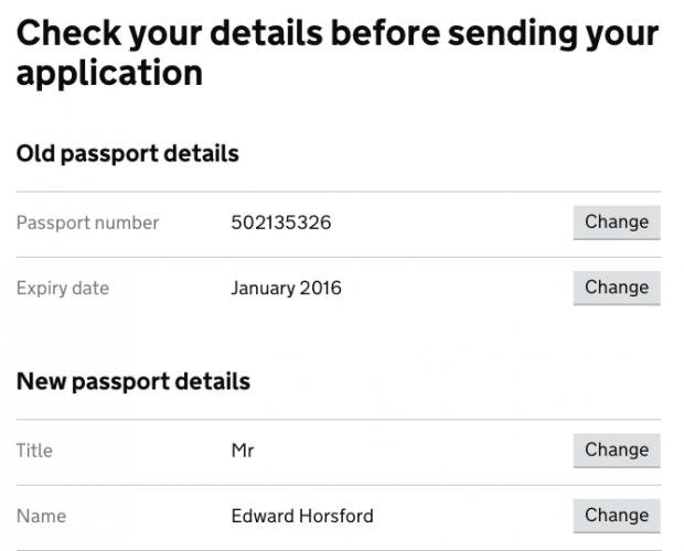
The pattern of our confirmation pages was important too. The rhythm of label, answer, change button, label, answer, change button, etc, meant users could listen to the information while tabbing through and quickly correct any mistakes they found.

For us, the sessions were hugely valuable. Both to make improvements, but also to validate some of the decisions we made building the service at the outset.
A related benefit – the sessions are great for increasing empathy for your users.
10 comments
Comment by Simon Hurst posted on
Really enjoyed this blog. I'm the researcher on Personal Independence Payment, a benefit that supports disabled people. It chimes with lots of things we've found whilst working with people with visual impairments.
It can take time to do the testing, it does take users a little longer to learn the layout and structure of the page, things we take in instantly when we see them. Once that is learned then users can often be faster than a sighted user.
I'd be interested to know what screenreaders you tested with, there are a variety, with some more popular than others. Webaim do a yearly survey that looks at the popularity of screen readers http://webaim.org/projects/screenreadersurvey6/. Did you see different results on different screenreader?
I'd also be interested in how you recruited the users, I've worked with RNIB and Sense (the charity for deafblind people) before, however, I haven't actually recruited through a lab yet. Seems like you didn't have many problems sorting it?
The other issue we encountered was repeated links. For example, on your 'check your details' page visually we can see what section the 'change' button relates to. This doesn't work for a screen reader user, we updated all our links to say 'change my address', 'change my name' whilst still displaying on screen as 'change this answer'. This made it far clearer to to the user what the purpose of the link was for as opposed to just hearing 'change' 'change' change'.
We also fed back to the gov.uk styles that visually impaired users struggled to see the grey used to highlight text boxes, it actually failed WCAG contrast guidance. It's now been changed, with the contrast significantly enhanced.
Comment by Ed Horsford posted on
Hi Simon,
The screen readers used were what the users brought with them. A mix of JAWs and VoiceOver from memory. The results were largely similar, though with the small sample size I wouldn't want to draw too many conclusions about how they compare. We did find some bugs that related to an older version of a specific screen reader.
Our user researcher John Waterworth recruited the users, so he should be able to answer how we did it. I don't think it was particularly hard, though we did have to give more notice.
On repeated links: you're right, links should be descriptive. Our change buttons have hidden text which is descriptive for screen reader users. The markup is:
<code><a href="#" role="button">Change<span class="visuallyhidden"> passport number</span></a></code>
Comment by Adrian Roselli posted on
You reference a "change button," which we can see in the screen shot is styled to look like a button, but your code sample shows it is an anchor instead of an HTML button or submit.
I am curious if during your testing you noticed users struggling to interact with this link, namely by pressing the space bar and expecting something to happen. I cannot see what event handlers you have on the link to know if you were listening for the space bar.
Comment by Ed Horsford posted on
Hi Adrian,
Yes, we have handlers for the space bar to make them behave like a button. However having just tested it, it doesn't seem to be working on those <em>specific</em> buttons! Other buttons/links in the service work fine with a space bar. We'll get it on the backlog to fix - thanks.
On whether we noticed users struggling with the link: The rhythm of the page made checking answers easy, and they were clear on the purpose. However, they made very few mistakes in the first place and self corrected errors straight away - so I'm not sure any actually needed to use the button.
Comment by John Waterworth posted on
We would have been recruiting participants through a rolling arrangement with recruitment agency. I don't remember there being any particular problems. We had to brief the recruiter carefully to make sure we got a range of visual impairments, and give them a bit more time for the recruit.
Comment by Alan Dalton posted on
Great write-up, Ed. Thanks for sharing that.
You mentioned that the sessions are great for increasing empathy for your users. I would add that such sessions can make designers, developers, and project managers more confident too. Seeing someone successfully use a webpage that you helped create can feel very rewarding — and give a well-earned ego-boost!
Comment by RS Pandey posted on
Government services should give priority to disable personnel in providing services. They should get priority over others.
http://www.exploremyindia.in
Comment by Chris Moore posted on
Ed, excellent blog. Valid point about users being reluctant to upgrade. I know many users still on Windows Xp as they are either on a fixed income, don't like the ribbon interface on newer versions of Windows (particularly with Microsoft Office) or feel they don't want to learn something new. The iPod Touch is also very popular with them basically being an iPhone with the GSM/LTE radios taken out and don't require a monthly subscription.
I can't stress how important it is that buttons and links must make sense when read out of context either by taking the CSS clip approach you took or by making buttons easier to understand for everyone like DWP did.
We need design patterns on this.
Comment by David posted on
This is excellent - I'll be forwarding it to those working on my service. We're lucky that we have Chris Moore (who commented above) working hard to keep us right in HMRC. Until you've seen how a visually impaired person has to use a service you can't properly imagine the difficulties they face. Seeing Chris try to navigate around our service was, frankly, mind-blowing!
All though we have Chris, the blog makes me think we should test more with visually impaired users to get a broader response. That broader response all adds weight to the argument that accessibility can not (must not) be considered an add-on. And having video clips of users struggling is extremely powerful.
Comment by Ed Horsford posted on
Hey David,
Yes, watching people use assistive technology is hugely powerful. I'd recommend spending some time using assistive tech yourself and see how you get on.
Yes I highly recommend usability testing with visually impaired users; accessibility isn't just about visual impairments though - this was just one part of a wider set of research we did on a range of disabilities.